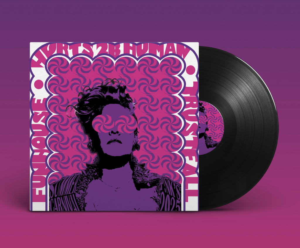
A complete album cover layout showing strong visual hierarchy and typographic styling.
Take a look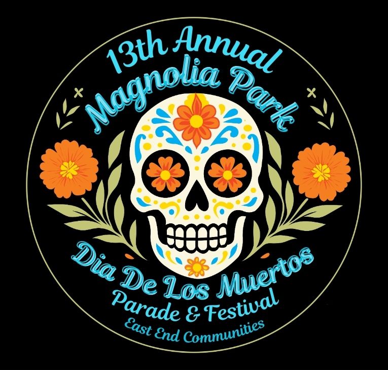
A logo rebranding project created for East End Communities to modernize the visual identity of their 13th annual Día de los Muertos Parade & Festival.
Take a lookThe Pink Album Cover is a creative branding and layout design project that combines typography, imagery, and visual storytelling to create a cohesive album identity. The goal was to develop an eye-catching cover that captures the mood and personality of the music while maintaining strong visual hierarchy and design principles.
Role: Graphic Designer
Tools/Skills:
Adobe InDesign • Adobe Photoshop • Graphic Design • Typography • Layout Design • Visual Hierarchy • Brand Identity • Composition • Image Editing
The challenge was to create an album cover that visually communicates the artist's style and theme while remaining engaging and recognizable. The design needed to balance imagery, color, and typography to create a strong visual identity.
I was responsible for:
- Developing the overall creative direction.
- Designing the cover layout and composition.
- Selecting and organizing typography.
- Creating visual hierarchy to guide viewer attention.
- Refining imagery and color choices to support the concept.
I explored different layout arrangements, typography treatments, and color combinations before selecting the final direction. The design focused on creating a balanced composition that emphasizes both the artist and the album title.
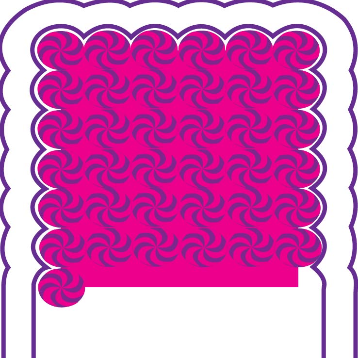
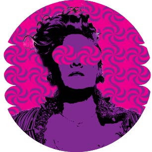
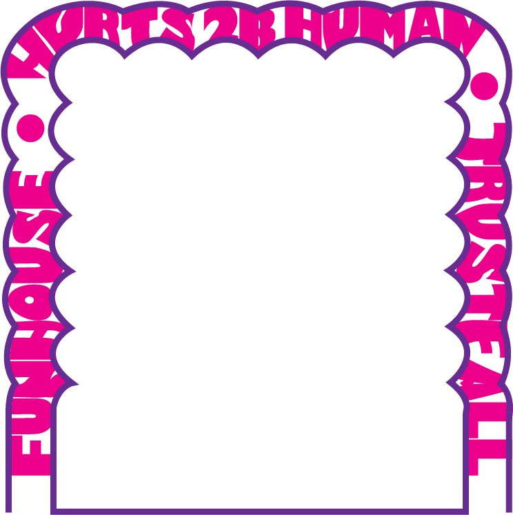
The final album cover uses strong visual hierarchy, cohesive typography, and carefully selected imagery to create a memorable and polished design. The project demonstrates my ability to combine branding and graphic design principles to communicate a visual story.
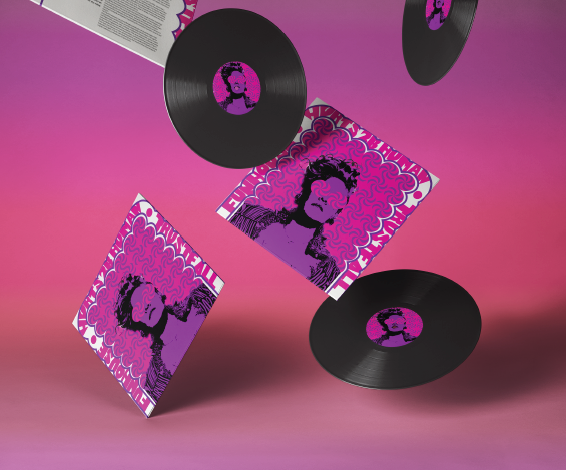
This project strengthened my skills in:
- Composition and layout
- Typography
- Brand storytelling
- Visual hierarchy
- Print-ready design
The Pink Album Cover demonstrates how thoughtful design decisions can create a strong visual identity. Through typography, imagery, and layout, the final piece communicates personality while maintaining a professional and cohesive appearance.

The Día de los Muertos Parade & Festival Rebrand was developed for East End Communities to refresh and modernize the visual identity of the annual celebration. The goal was to create a logo that honored the cultural significance of the event while improving brand recognition across print and digital marketing materials.
Role: Brand Designer
Organization
East End Communities
Tools/Skills:
Adobe Illustrator • Branding • Logo Design • Typography • Visual Identity Design • Illustration • Creative Direction • Client Communication
East End Communities needed a refreshed logo that celebrated the traditions of Día de los Muertos while creating a unified and recognizable identity for the parade and festival. The design needed to be culturally respectful, visually engaging, and adaptable across multiple formats.
I was responsible for:
- Creating logo concepts and visual directions.
- Developing illustrations and graphic elements.
- Selecting typography and color palettes.
- Refining designs based on client feedback.
- Preparing logo variations for different applications.
To develop the identity, I researched traditional Día de los Muertos imagery and symbolism, including:
- Marigold flowers
- Papel picado
- Sugar skull motifs
- Cultural color palettes
- Community-focused celebrations
This research informed the visual direction and helped ensure the design remained authentic and meaningful.
I explored multiple concepts before refining the final direction. Various logo layouts, typography treatments, and graphic elements were tested to create a design that balanced tradition with a modern visual approach.
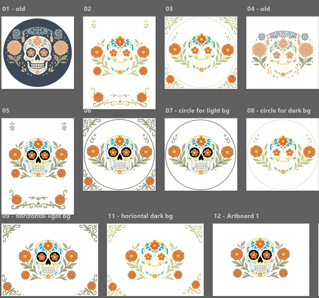
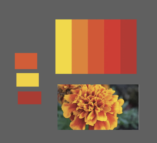
The final logo incorporates culturally inspired elements while maintaining flexibility across promotional materials, social media graphics, event signage, and marketing collateral.
Key design features include:
- Strong visual identity
- Culturally inspired illustration
- Scalable logo system
- Event-focused branding
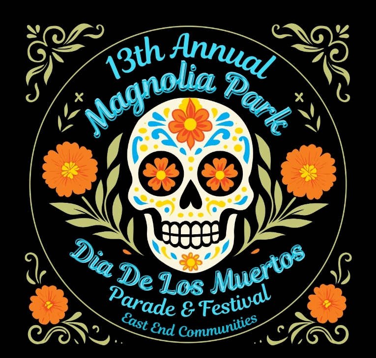
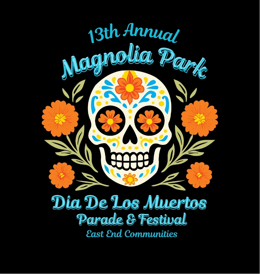
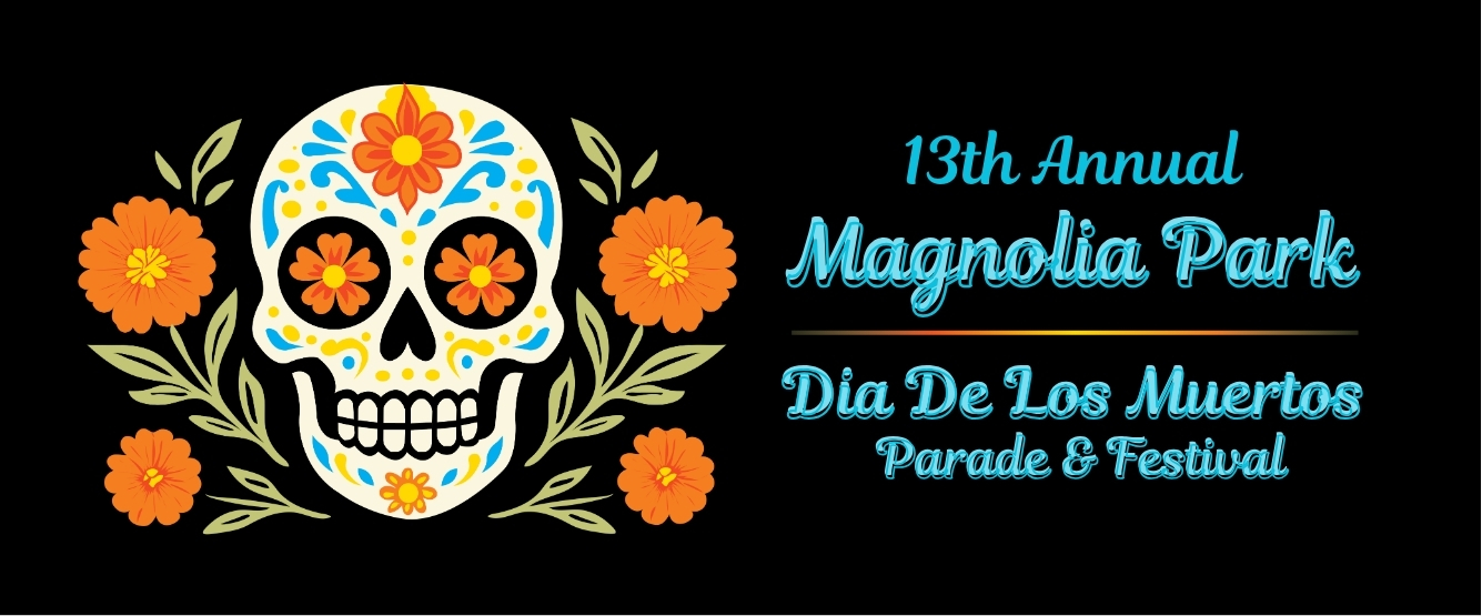
This project strengthened my skills in:
- Client-based design
- Brand identity development
- Cultural research
- Visual storytelling
- Design presentation and revision processes
The redesigned logo provides East End Communities with a stronger visual identity for the annual Día de los Muertos Parade & Festival. The project demonstrates my ability to create meaningful branding solutions that honor culture, support community engagement, and communicate a clear visual message.